Marker View
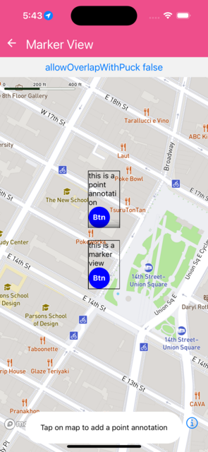
Shows marker view and point annotations, including an interactive marker with sliders, switch, counter, text input, and pressable button to verify complex touch interactions inside a MarkerView. Toggle pointerEvents="none" to make the marker transparent to all touch events, passing them through to the map.
import React from 'react';
import {
  Button,
  Pressable,
  StyleSheet,
  Switch,
  Text,
  TextInput,
  TouchableOpacity,
  View,
} from 'react-native';
import { Slider } from '@rneui/base';
import Mapbox from '@rnmapbox/maps';

import Bubble from '../common/Bubble';

const styles = StyleSheet.create({
  touchableContainer: { borderColor: 'black', borderWidth: 1.0, width: 60 },
  touchable: {
    backgroundColor: 'blue',
    width: 40,
    height: 40,
    borderRadius: 20,
    alignItems: 'center',
    justifyContent: 'center',
  },
  touchableText: {
    color: 'white',
    fontWeight: 'bold',
  },
  matchParent: { flex: 1 },
  interactiveCard: {
    backgroundColor: 'white',
    borderRadius: 12,
    padding: 12,
    width: 200,
    shadowColor: '#000',
    shadowOffset: { width: 0, height: 2 },
    shadowOpacity: 0.25,
    shadowRadius: 4,
    elevation: 5,
    borderWidth: 1,
    borderColor: '#ddd',
  },
  cardTitle: {
    fontWeight: 'bold',
    fontSize: 13,
    marginBottom: 8,
    color: '#333',
  },
  sliderLabel: {
    fontSize: 11,
    color: '#666',
    marginBottom: 2,
  },
  sliderValue: {
    fontSize: 11,
    fontWeight: '600',
    color: '#333',
    textAlign: 'right',
  },
  sliderRow: {
    flexDirection: 'row',
    alignItems: 'center',
    justifyContent: 'space-between',
    marginBottom: 4,
  },
  switchRow: {
    flexDirection: 'row',
    alignItems: 'center',
    justifyContent: 'space-between',
    marginVertical: 4,
  },
  switchLabel: {
    fontSize: 11,
    color: '#666',
  },
  counterRow: {
    flexDirection: 'row',
    alignItems: 'center',
    justifyContent: 'center',
    marginVertical: 6,
  },
  counterButton: {
    backgroundColor: '#4A90D9',
    width: 30,
    height: 30,
    borderRadius: 15,
    alignItems: 'center',
    justifyContent: 'center',
  },
  counterButtonText: {
    color: 'white',
    fontWeight: 'bold',
    fontSize: 16,
  },
  counterValue: {
    fontSize: 16,
    fontWeight: 'bold',
    marginHorizontal: 16,
    minWidth: 24,
    textAlign: 'center',
  },
  textInput: {
    borderWidth: 1,
    borderColor: '#ccc',
    borderRadius: 6,
    paddingHorizontal: 8,
    paddingVertical: 4,
    fontSize: 11,
    marginTop: 4,
    backgroundColor: '#fafafa',
  },
  pressableButton: {
    marginTop: 8,
    backgroundColor: '#4A90D9',
    borderRadius: 6,
    paddingVertical: 6,
    alignItems: 'center',
  },
  pressableButtonPressed: {
    backgroundColor: '#2E6DB4',
  },
  pressableText: {
    color: 'white',
    fontWeight: '600',
    fontSize: 12,
  },
  colorPreview: {
    height: 20,
    borderRadius: 4,
    marginTop: 4,
    borderWidth: 1,
    borderColor: '#ccc',
  },
  divider: {
    height: 1,
    backgroundColor: '#eee',
    marginVertical: 6,
  },
});

const AnnotationContent = ({ title }: { title: string }) => (
  <View style={styles.touchableContainer} collapsable={false}>
    <Text>{title}</Text>
    <TouchableOpacity style={styles.touchable}>
      <Text style={styles.touchableText}>Btn</Text>
    </TouchableOpacity>
  </View>
);

/**
 * An interactive MarkerView with slider, switch, counter, text input, and
 * pressable button — useful for verifying that complex touch interactions
 * work correctly inside a MarkerView.
 */
const InteractiveMarkerContent = () => {
  const [sliderValue, setSliderValue] = React.useState(0.5);
  const [opacity, setOpacity] = React.useState(1.0);
  const [toggleOn, setToggleOn] = React.useState(false);
  const [counter, setCounter] = React.useState(0);
  const [note, setNote] = React.useState('');
  const [pressCount, setPressCount] = React.useState(0);

  const hue = Math.round(sliderValue * 360);
  const bgColor = `hsla(${hue}, 70%, 55%, ${opacity})`;

  return (
    <View style={styles.interactiveCard} collapsable={false}>
      <Text style={styles.cardTitle}>Interactive Marker</Text>

      {/* Slider: Hue */}
      <View style={styles.sliderRow}>
        <Text style={styles.sliderLabel}>Hue</Text>
        <Text style={styles.sliderValue}>{hue}°</Text>
      </View>
      <Slider
        value={sliderValue}
        onValueChange={setSliderValue}
        minimumValue={0}
        maximumValue={1}
        step={0.01}
        thumbStyle={{ width: 18, height: 18 }}
        trackStyle={{ height: 4 }}
        minimumTrackTintColor="#4A90D9"
        maximumTrackTintColor="#ccc"
      />

      {/* Slider: Opacity */}
      <View style={styles.sliderRow}>
        <Text style={styles.sliderLabel}>Opacity</Text>
        <Text style={styles.sliderValue}>{opacity.toFixed(2)}</Text>
      </View>
      <Slider
        value={opacity}
        onValueChange={setOpacity}
        minimumValue={0}
        maximumValue={1}
        step={0.05}
        thumbStyle={{ width: 18, height: 18 }}
        trackStyle={{ height: 4 }}
        minimumTrackTintColor="#E8913A"
        maximumTrackTintColor="#ccc"
      />

      {/* Color preview */}
      <View style={[styles.colorPreview, { backgroundColor: bgColor }]} />

      <View style={styles.divider} />

      {/* Switch */}
      <View style={styles.switchRow}>
        <Text style={styles.switchLabel}>
          Toggle: {toggleOn ? 'ON' : 'OFF'}
        </Text>
        <Switch value={toggleOn} onValueChange={setToggleOn} />
      </View>

      <View style={styles.divider} />

      {/* Counter */}
      <View style={styles.counterRow}>
        <TouchableOpacity
          style={styles.counterButton}
          onPress={() => setCounter((c) => c - 1)}
        >
          <Text style={styles.counterButtonText}>−</Text>
        </TouchableOpacity>
        <Text style={styles.counterValue}>{counter}</Text>
        <TouchableOpacity
          style={styles.counterButton}
          onPress={() => setCounter((c) => c + 1)}
        >
          <Text style={styles.counterButtonText}>+</Text>
        </TouchableOpacity>
      </View>

      <View style={styles.divider} />

      {/* Text input */}
      <Text style={styles.sliderLabel}>Note</Text>
      <TextInput
        style={styles.textInput}
        value={note}
        onChangeText={setNote}
        placeholder="Type something…"
        placeholderTextColor="#aaa"
      />

      {/* Pressable button */}
      <Pressable
        style={({ pressed }) => [
          styles.pressableButton,
          pressed && styles.pressableButtonPressed,
        ]}
        onPress={() => setPressCount((c) => c + 1)}
      >
        <Text style={styles.pressableText}>
          Pressed {pressCount} time{pressCount !== 1 ? 's' : ''}
        </Text>
      </Pressable>
    </View>
  );
};

const INITIAL_COORDINATES: [number, number][] = [
  [-73.99155, 40.73581],
  [-73.99155, 40.73681],
  [-73.98955, 40.73581],
];

const ShowMarkerView = () => {
  const [pointList, setPointList] =
    React.useState<GeoJSON.Position[]>(INITIAL_COORDINATES);
  const [allowOverlapWithPuck, setAllowOverlapWithPuck] =
    React.useState<boolean>(false);
  const [pointerEventsNone, setPointerEventsNone] =
    React.useState<boolean>(false);

  const [mapMoveCount, setMapMoveCount] = React.useState(0);

  const onPressMap = (e: GeoJSON.Feature) => {
    const geometry = e.geometry as GeoJSON.Point;
    setPointList((pl) => [...pl, geometry.coordinates]);
  };

  const onRegionDidChange = React.useCallback(() => {
    setMapMoveCount((c) => c + 1);
  }, []);

  return (
    <>
      <Button
        title={
          allowOverlapWithPuck
            ? 'allowOverlapWithPuck true'
            : 'allowOverlapWithPuck false'
        }
        onPress={() => setAllowOverlapWithPuck((prev) => !prev)}
      />
      <Button
        title={
          pointerEventsNone
            ? 'pointerEvents="none" – tap/drag passes to map'
            : 'pointerEvents="auto" – marker handles touches'
        }
        onPress={() => setPointerEventsNone((prev) => !prev)}
      />
      <Mapbox.MapView onPress={onPressMap} onRegionDidChange={onRegionDidChange} style={styles.matchParent}>
        <Mapbox.Camera
          defaultSettings={{
            zoomLevel: 16,
            centerCoordinate: pointList[0],
          }}
        />

        <Mapbox.PointAnnotation coordinate={pointList[1]!} id="pt-ann">
          <AnnotationContent title={'this is a point annotation'} />
        </Mapbox.PointAnnotation>

        <Mapbox.MarkerView
          coordinate={pointList[0]!}
          allowOverlapWithPuck={allowOverlapWithPuck}
          pointerEvents={pointerEventsNone ? 'none' : 'auto'}
        >
          <AnnotationContent title={'this is a marker view'} />
        </Mapbox.MarkerView>

        <Mapbox.MarkerView
          coordinate={INITIAL_COORDINATES[2]!}
          allowOverlap
          allowOverlapWithPuck={allowOverlapWithPuck}
        >
          <InteractiveMarkerContent />
        </Mapbox.MarkerView>

        {pointList.slice(3).map((coordinate, index) => (
          <Mapbox.PointAnnotation
            coordinate={coordinate}
            id={`pt-ann-${index}`}
            key={`pt-ann-${index}`}
          >
            <AnnotationContent title={'this is a point annotation'} />
          </Mapbox.PointAnnotation>
        ))}

        <Mapbox.NativeUserLocation />
      </Mapbox.MapView>

      <Bubble>
        <Text>Map moved: {mapMoveCount} times</Text>
        <Text>Tap on map to add a point annotation</Text>
      </Bubble>
    </>
  );
};

export default ShowMarkerView;
 }
}